Bookspan
Helping a century old company develop a truly digital business and service framework for a suite of membership clubs.
With
Moment + Bookspan
When
2014
What
Product strategy
Revenue model design
White label web platform
Team
Design director
UX design lead (me)
Visual design
—CEO
COO
Head of product
Business analyst
―
Our client’s aging business model hadn't transitioned well from decades of physical catalogs and mailers across membership 'clubs' onto digital channels.
We partnered with them to:
ideate through new business models and define the best experience for their customers
design a web platform to support each membership 'club' around the new business model
Process
1.
Understanding the current business and its pain points
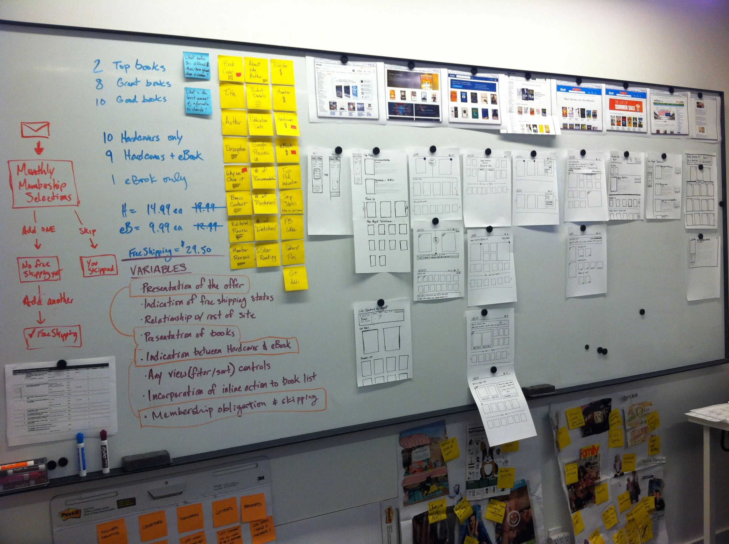
We kicked off the project with multiple, half-day workshops to understand the client's current situation, who their target customer was and what ideas they had for a new business approach.
The current website was perceived an e-commerce store not a membership service.
The current business still relied on mailer catalogs for a large portion of its audience.
2.
Concepting a new service and value proposition through interface sketching
We used fast pen and paper interface sketches to flesh out nuances of the potential business models to determine the kind of experience it would offer the user.
To validate new business model ideas, we sketched ideas to see how clearly we could communicate through an interface.
These sketch concepts helped the team evaluate our ideas and iterate on different membership offerings, all the while considering how this provided a unique value to our users.
Initial ideas were focused around a negative-option model where users needed to opt-out of a deal otherwise they'd be charged an amount, receive digital credits, and use that deal at a later date.
An early breakdown of the core value proposition for the service and how that would be reflected within the service offerings.
As we iterated through designs, we found the business model was to complex and difficult to communicate to our users.
This decision shifted the direction to an all credit-based membership that provided deals on books.
3.
User scenario "sprints"
After finalizing on a new business model and clarifying the key user scenarios, we embarked on a fast and lean design process.
For each user scenario, we did roughly 2 days per iteration cycle and went through 2-4 iterations per story.
We were able to handle such a quick timing because we were only designing and prototyping high fidelity wireframes. We chose to only deliver wireframes because this was a platform that would be used across multiple service memberships, each with their own brand style.
4.
Wireframe prototypes
Rapid prototyping was critical to our process on this project, and Invision was our tool of choice. The simple navigation prototypes we were able to build helped us validate our concepts and communicate complex interactions to our client.
For example, one of the biggest interaction challenges was on the checkout cart screen. We needed an easy way for users to apply the "club credits" to specific books, understand how much they were going to pay, know which books they weren't getting with club credit, as well as coupon code rules. We went through many different structures on how this could be accomplished and built out non-restrictive prototypes that let us and the client play around with the interface. This allowed us to be confident in the final direction.
The video below illustrates the prototype for the final direction:
5.
Prototypes as final deliverables and specifications
To keep with our desire to be fast and nimble, we ditched the typical, lengthy interaction specification document and attempted a new process of delivering just prototypes as the final document to the client team. We repurposed Invision's "comment/collaboration" feature to provide any additional interaction logic that wasn't directly apparent within the prototypes.
Results
—
We helped our client team work through a complex business problem by keeping focus on our users and understanding how they'd find value in the service.
We provided our client team with a robust foundation for their new website platform to support this new service and in a format that their development team could more readily consume without direct communication.
The client rolled out the initial beta program for the first membership club in February 2015.


