Modular empathy toolkit
Reframing personas into a modular toolkit for designers, product owners and engineers to build more user empathy.
With
Moment + TD Ameritrade
When
2013
What
Qualitative user research
Quantitative user research
Research toolkit
Workshop development
Team
Design director
UX design lead (me)
Visual design lead
—Client design sponsor
Client tech sponsor
―
Our client needed to better understand the habits and motivations of personal investors who are supported by financial advisors through qualitative research.
Initially our goal was to conduct research interviews with investors to:
validate ideas around a website redesign
learn more about their habits and motivations
The qualitative insights of our research were so engaging that our partner asked us to develop it into a tool to spread these insights to more roles and departments within the company.
Process
1.
Research Prep and initial hypothesis
We kicked off the project by understanding the client's current assumptions about their users and identifying the major questions we wanted to know more about.
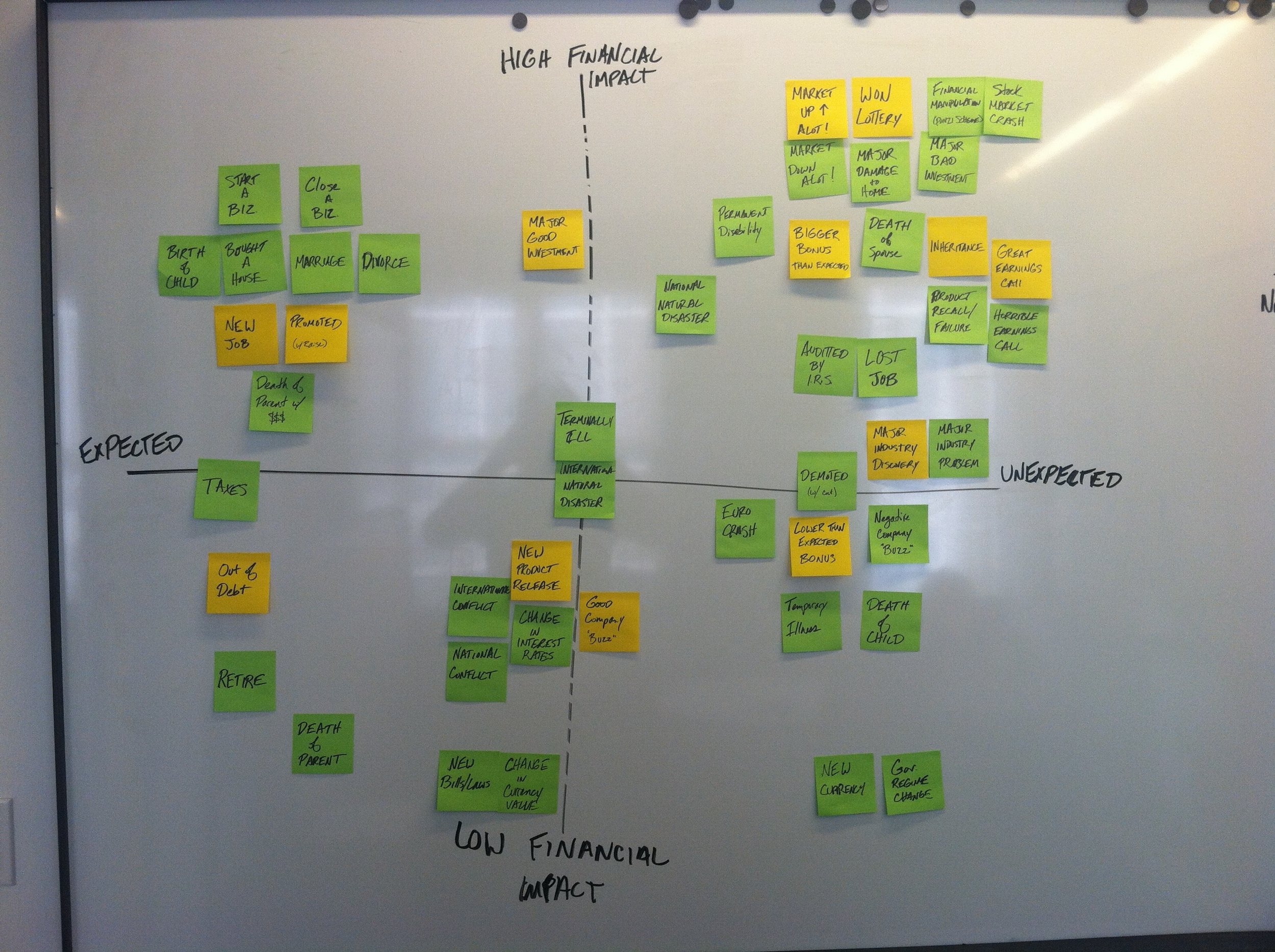
Initial model for different external events that may affect a user.
Our initial hypothesis of user behavior model. This helped guide the questions for our research protocol.
Initial breakdown at core user archetypes.
Even at the beginning of the project, we anticipated our research findings being extensive enough to warrant a card-based persona tool. Here's an initial prototype to experiment with the idea.
2.
Research and synthesis
Our approach for the research was to speak remotely with 14 advised investors and split the conversations into two parts. Part one was qualitative inquiry around their investing habits and motivations. Part two was reviewing a desktop or mobile app prototype concept to get their feedback on some new ideas.
With remote interviews, its important that the participant feels as comfortable as possible. We turned our web cam on even if the participant didn't have one, so they could see our facial reactions to their feedback. To make sure we "maintained eye contact" with our participant, we put a little "frog" behind the camera so that we'd feel more comfortable staring into the laptop camera.
After completing the research interviews, we broke down all of the notes into individual chunks. Each team member went through every interview to identify patterns and critical insights. We then regrouped and discussed our individual findings to refine our analysis.
3.
Modular persona decks
We developed five different user models as way to organize the complex sets of behaviors and needs of being an advised investor.
We turned these five user models into individual card decks with three to seven cards each. A designer/engineer/product owner, can then mix and match one card from each deck to explore and consider different investor motivations.
4.
Deck extensions
Our initial modular persona cards was so well received with the client team, that they wanted to extend the scope of the kit from just investors with financial advisors to all investors. If we succeeded with this, it meant the persona cards would be useful to a much wider audience within the client's company.
We coordinated a workshop with members from different groups and roles to introduce the advisor toolkit and get their input on what might be missing to broaden the toolkit to cover retail investors.
Brainstorming additional cards and decks for extending the toolkit.
We explored a variety of different new decks and cards.
Our "Investing Mentalities" deck required a major pivot and rethink to encapsulate the larger audience base.
We explored adding a new deck around on how employment situations and access to different devices might affect investing habits.
5.
Toolkit and the Beta program
Once we had our modular persona decks updated, we created a full toolkit and developed a beta program to introduce the toolkit to a wider range of employees. The beta program was meant to help us gain more insight around how people might use the toolkit, if it changed how they work through problems and how it might bring people together through collaborative activities and workshops.
For the beta program, we planned and facilitated workshops with different teams to introduce the different ways in which the toolkit could be used. We also provided them with other sample workshop agendas they could run themselves as well as worksheets to help in planning which decks would be most useful for the particular problem they were trying to work on.
6.
Quantitative research
In addition to the employee beta program, we also ran a quantitative research survey with a 300+ group of current customers to see how they might self identify within the different deck models and individual characteristics.
This excel screenshots shows only a small sampling of the data we received from each participant with a bit of organization and color coding by deck to make scanning easier.
The quantitative research was a great success and gave us numbers to add into the toolkit to bolster it credibility with number-focused team members. We also used this data to make further updates and refinements to the different characteristics to make them as accurate as we could.
Results
—
Rather than delivering a typical set of user personas, we delivered a tool that communicated and respected the variety of their user’s complex arrangements of motivations, behaviors and contexts.
The participants of the beta program were excited about the toolkit, and how it might change their approach to thinking about their customers. It also helped create a common vocabulary between the different employee roles (designers, engineers and product owners) to have better conversations about and with their customers.
The toolkit was initially delivered to just the design and some of the product teams. Our main stakeholder was so thrilled with the results, she intended to spread the toolkit to more departments in the company including customer service and marketing.


