Great Big Story
Defining a new brand and mobile-first service to bring quality video storytelling back into people's social feeds.

With
Moment + CNN
When
2015
What
Brand definition
Product strategy
Responsive web
iPhone app
Team
Design director
UX design lead (me)
Visual design
—CEO
Creative director
Tech director
Sr. producer
Business consultants
—
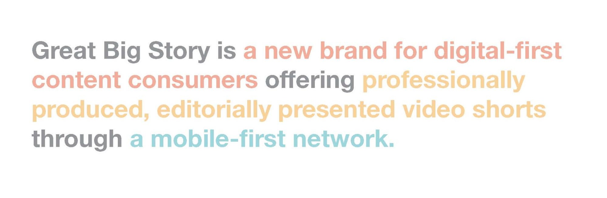
Our client had an idea for a new business opportunity for a storytelling service that would actually resonate with digital first consumers.
We partnered with them to help develop that idea into a user first digital service because for this service to prosper, people had to watch these stories from anywhere: facebook stream-to-native app, mobile-to-desktop and perhaps even TV.
Process
1.
Value Proposition and Brand Development
We kicked off the project by brainstorming with the client team to understand current thoughts around this new brand's value, voice, tone, audience and offering.
I helped the team identify where they stood in relation to potential competition, as well as lead the effort to synthesize the new brand's value proposition. As we were synthesizing the various attributes, I found Aaron Walter's brand personality technique of "[x] but not [y]" very helpfull in creating clarity across the team.
2.
Service Blueprint and Scenario Development
Next I identified the primary user scenarios to illustrate how discovery of this service would happen on a social network. We also used a service blueprint to help the team start to identify the technical foundations and user actions.
3.
Responsive Web Concepting
This project was a true collaboration between the design team and our partners. They participated in early sketch ideation and paper prototyping workshops.

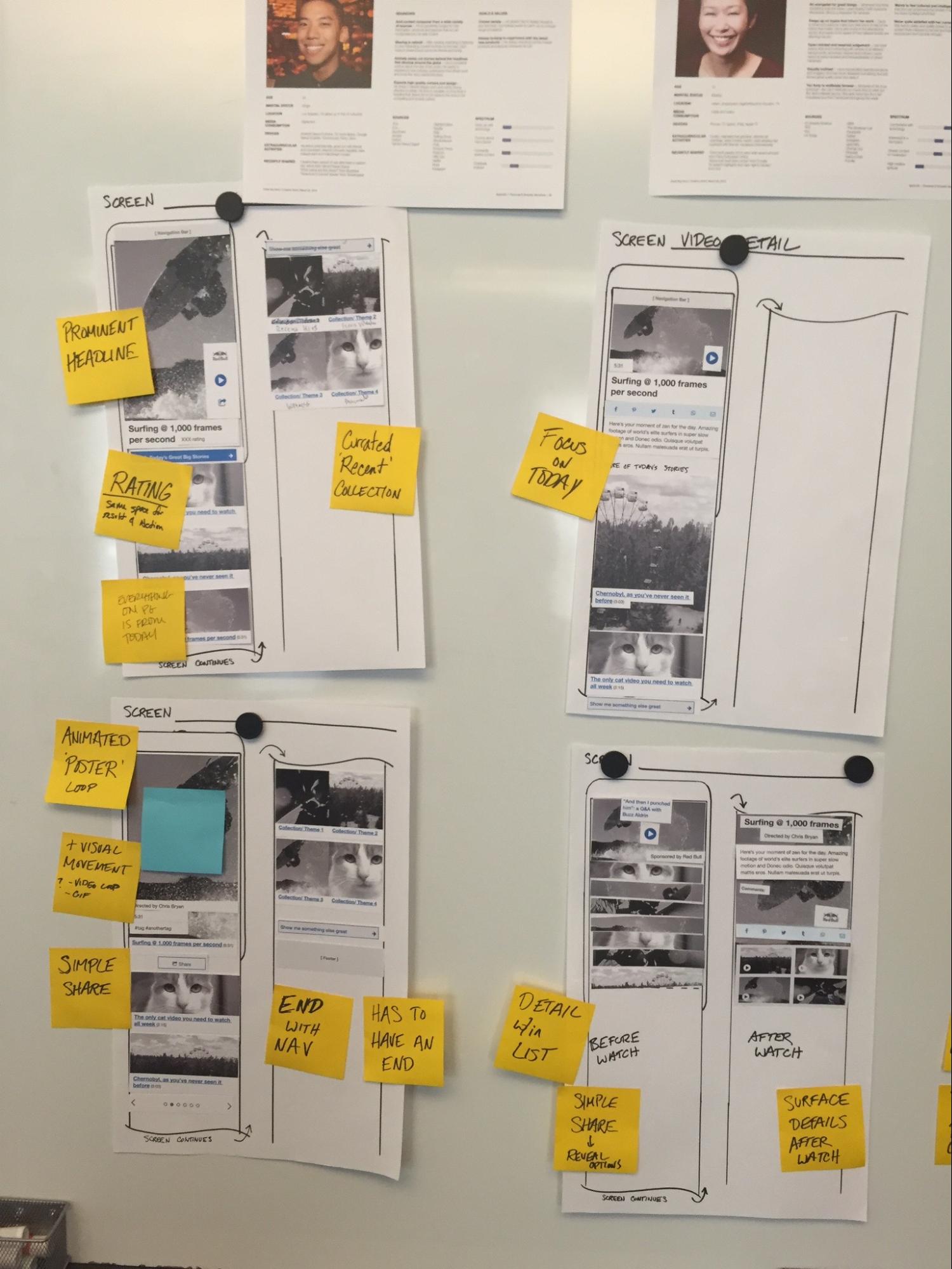

We focused on designing a mobile-first responsive framework because we knew to support access from any device, the service would have to start as web-based.
How might the layout respond to different viewport widths?
How might direct link URL vs. browsing experience be different?

4.
Responsive Web Prototyping
To validate our hypothesis that the interface could be straight forward and make the content the star of the show, I built web prototypes using adobe edge and adobe animate for multiple viewports.
Something more than static images while scrolling
Transition from a list to a video
5.
iPhone App Concepting and Prototyping
After we had the responsive web design near completion, we started on designing a native iPhone app. This would allow development of the responsive website to happen first and then the team could launch the iPhone app as a fast follow. This was intended to support early adopters and give them a destination to become advocates.
The critical benefit of a native app was the ability to auto-play videos as soon as the user had selected one from the stream. This isn't possible on iPhone mobile web, but is on Android.
I worked with my team to take the previously established design system and pushed it further to make the app feel truly native.
Myself and another designer used Framer.js to build a robust prototype that came close to feeling like a native app. He was even able to get the auto-play video working in the prototype.
Result
—
At the end of several months of effort we had designed a truly multi-channel experience with unexpected, seductive, editorial video shorts as the center piece and the interfaces as the support system. Bringing interesting and professional quality stories to the people (instead of having the people come to them).
The service launched in October 2015 and is still going strong. The company and the day-to-day team has continued to update the product and app as they've found and developed their content voice and strategy.
If you have a spare minute, I highly recommend you go watch a story or two over at Great Big Story
